The interior design guide. A definitive knowledge base for interior designers.

From first principles to the finishing touches: shell, surfaces, space planning, furniture, electrics, plumbing and joinery, in the order a project runs.

The Lexicon.

Every term, in plain words.

From hue and light reflectance to bonding and kick space, every term the guide uses has a short definition, what to know in practice and the pages that use it.

Use the guide in your AI assistant.

Connect Claude or ChatGPT.

The guide has an MCP server, so your assistant can search it, read its pages and cite them while it answers you. It is free, read-only, and needs no account or key.

Connect to Claude
Open docs
All sections

The interior design guide.

A definitive knowledge base for interior designers.

Eleven chapters take a home from first principles to the moment you show it to the client. Start with Foundations and read in order, or search for a topic, a term or a rule of thumb.

Chapters.

Eleven steps, from principles to presentation.

Keep reading.

Where to go next.

Sections.

Keep reading.

Where to go next.

Colour and materiality,

and the surfaces that carry it.

In a room, colour never arrives alone. It comes on a surface (plaster, linen, oak, stone) under a light that changes all day. Learn how colours relate on the wheel, how to set their proportions and how texture changes what a colour does, and a palette holds together from the paint chip to the finished room.

Three dimensions of colour.

Hue, value, saturation.

Every colour can be described by three properties. Hue is its family on the wheel. Value is how light or dark it is. Saturation is how intense or greyed it is. In rooms, value does most of the work: a scheme with good value contrast reads well even in black and white.

Hue
Value
Saturation

The colour wheel.

Pick a colour, then a harmony.

Painters and designers use a red–yellow–blue wheel; screens mix red–green–blue. In interiors the wheel is a tool for relationships, not for choosing pure hues: find the harmony here, then knock every colour back with grey or white before it goes on a wall.

On the wheel
Knocked back for a room

Click any segment. The wheel turns on its own until you do.

Basic concepts.

The vocabulary of the wheel.

Primary
Secondary
Tertiary

Primary, secondary, tertiary

Primaries can’t be mixed from others. Two primaries make a secondary; a primary and its neighbouring secondary make a tertiary.

Complementary

Opposites on the wheel. Side by side they intensify each other; mixed, they neutralise into a grey. That is how a too-pink beige is calmed with a touch of green.

Analogous

Neighbours on the wheel. They share a hue, so they always sit together; the risk is monotony, not clash.

Warm and cool

Warm colours advance and feel close; cool colours recede and feel airy. A north-facing room reads cooler, so warm its neutrals.

Tint
Tone
Shade

Tint, tone, shade

Add white, grey or black. Almost every colour used in a home is a tone: a hue softened with grey.

greenbluepink

Neutrals have undertones

No grey is truly neutral. Read the undertone against white paper, and keep one undertone family per room.

Finding your palette.

Choose one, or make your own.

Colour sets the mood of a room before anything else, and it is hard to undo: walls, floors and fabrics are chosen once and lived with for years. A palette that holds together lets every choice support the others; one that does not makes even good pieces look wrong. Start here from a palette built to work in a room, or from a colour you already love. Edit any colour to build a palette around it, drag colours into order, add one between two others or take one out, then copy the codes to take to paint charts and samples.

Make your own palette

Colour systems.

How colours are named and matched.

To specify a colour so it can be reproduced, designers give it a code from a system. Reference systems (Munsell, NCS) map all of colour space. Libraries (Pantone, RAL) are numbered sets for products and coatings. Paint brands sell their own named ranges; matching one brand’s colour in another’s paint is only ever approximate.

876543/0/2/4/6/8/10
Value ↑Chroma →

Munsell

Describes any colour by three numbers: hue, value (0 black to 10 white) and chroma (intensity). A notation like 5YR 6/8 reads as hue 5YR, value 6, chroma 8. It is the model behind most colour science and soil, skin and stone charts.

Official site
WSC

NCS

The Natural Colour System, Scandinavia’s standard and common in European architecture. S 2050-Y50R means 20% blackness, 50% chromaticness, hue halfway between yellow and red. It describes colour the way we see it, not how it is mixed.

Official site
PANTONE19-4052 TCXClassic Blue
PANTONE17-1230 TCXMocha Mousse
PANTONE13-1023 TCXPeach Fuzz

Pantone

A numbered library of standard colours used across fashion, product and interiors. Textile and home codes end in TCX or TPG. Use it to brief a fabric or product colour to a supplier; it is not a paint range.

Official site
RAL 9010
RAL 1015
RAL 6021
RAL 7044
RAL 7016

RAL

The German standard for coatings, powder coat and industrial finishes. RAL Classic codes like RAL 9010 or RAL 7016 are how window frames, radiators, metalwork and kitchens are specified.

Official site

Material.

The second colour.

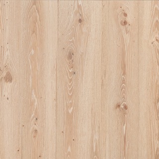
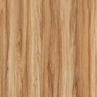
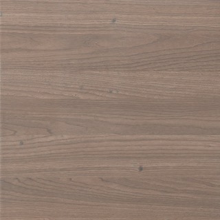
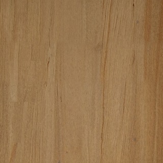
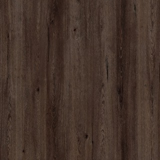
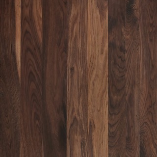
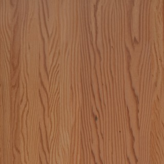
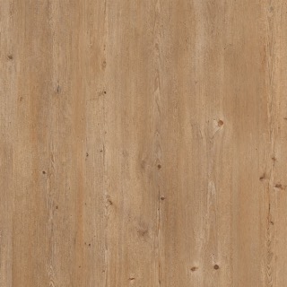
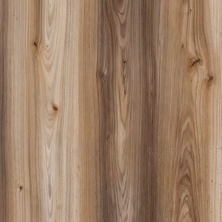
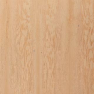
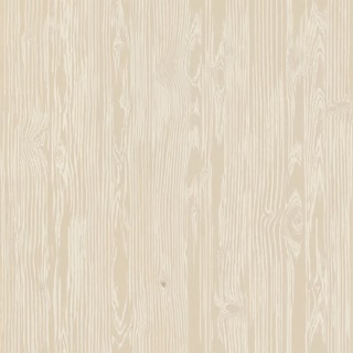
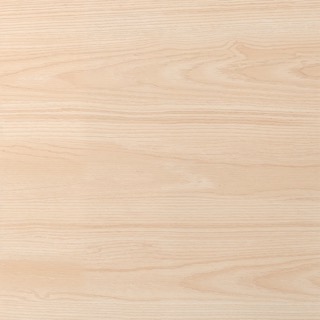
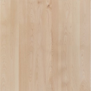
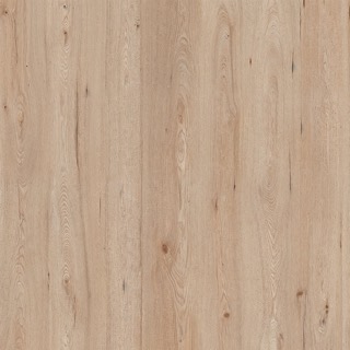
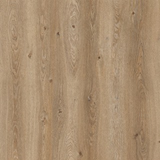
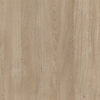
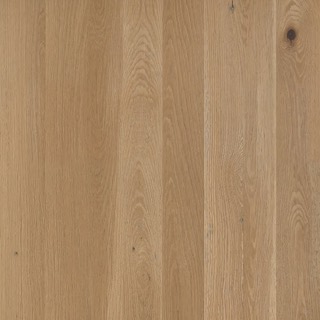
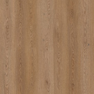
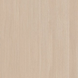
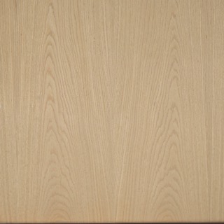
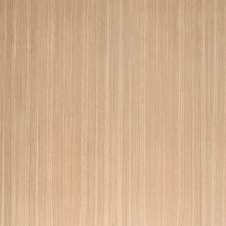
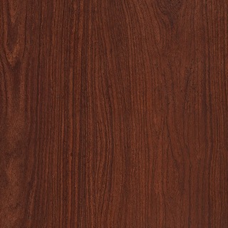
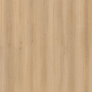
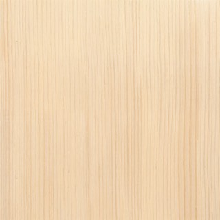
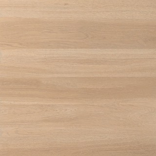
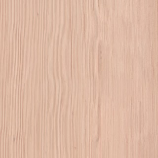
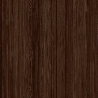
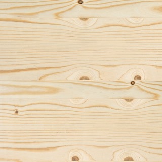
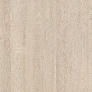
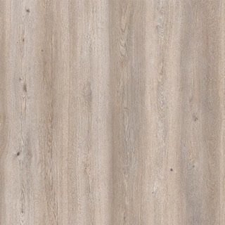
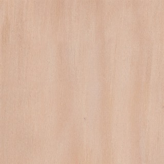
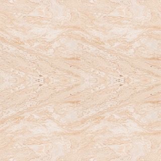
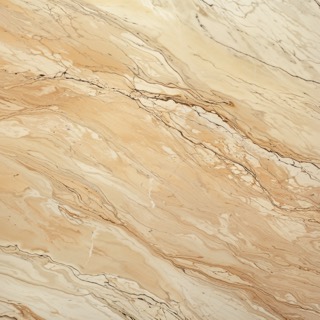
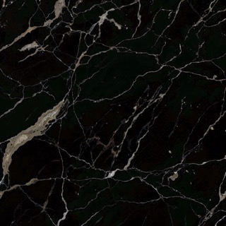
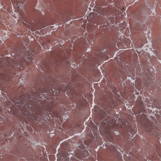
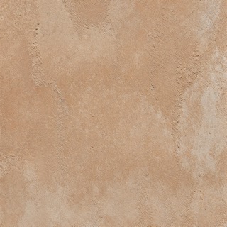
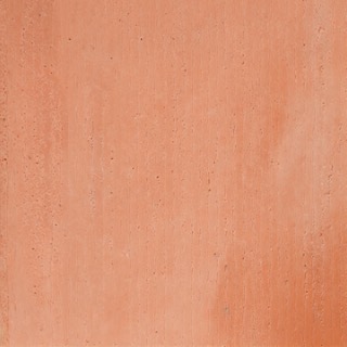
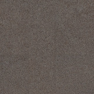
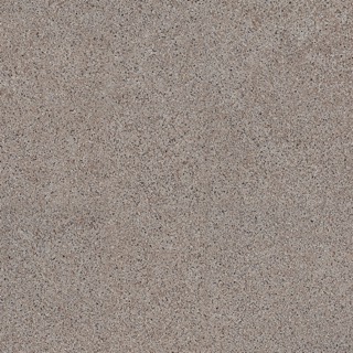
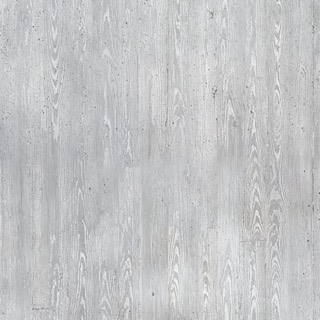
Texture is how a surface feels to the hand and how it handles light. Rooms that feel finished contrast texture more than colour: rough against smooth, matt against sheen, soft against hard. Texture also shifts colour: piles and loops throw tiny shadows and read darker and warmer, gloss reflects its surroundings and reads lighter and cooler. Pair at least three textures in any room.

Ash Wood texture
Ash Wood
Brown Epicea texture
Brown Epicea
Cedar texture
Cedar
Cherry texture
Cherry
Dark Brown Oak texture
Dark Brown Oak
Deep brown oak texture
Deep brown oak
Dark Tech texture
Dark Tech
Dark Walnut texture
Dark Walnut
Douglas Dark texture
Douglas Dark
Epicea texture
Epicea
Exotic texture
Exotic
Fir Douglas texture
Fir Douglas
Light Ash Wood texture
Light Ash Wood
Light Oak texture
Light Oak
Maple texture
Maple
Maple Light texture
Maple Light
Mountain Oak texture
Mountain Oak
Oak texture
Oak
Knotty oak texture
Knotty oak
Oak Rustique texture
Oak Rustique
Oak Veneer texture
Oak Veneer
Golden oak veneer texture
Golden oak veneer
Oak White texture
Oak White
Pine texture
Pine
Red Wood texture
Red Wood
Royal Oak texture
Royal Oak
Siberian Pine texture
Siberian Pine
Soft Brown Oak texture
Soft Brown Oak
Soft Douglas texture
Soft Douglas
Tech texture
Tech
Timber texture
Timber
White Maple texture
White Maple
White Oak texture
White Oak
Yellow Birch texture
Yellow Birch

Tiling textures.

Any material, laid in a pattern.

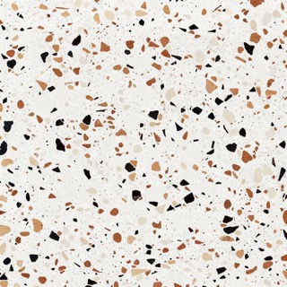
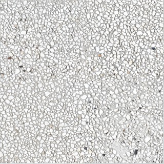
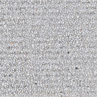
A floor or wall finish is a material and a way of laying it. Pick one of the materials above and a pattern, then set the grain’s scale, the tile size and the joints. The result is one square metre that repeats without a seam, ready to download and apply in a model or a render.

Keep reading.

Where to go next.

Questions.

What people ask most about colour.

What colours go with green?

Green pairs naturally with the colours found next to it outdoors: warm whites, sand, terracotta, wood tones and soft pinks. Sage and olive greens suit cream, ochre and brass; deep greens suit navy, burgundy and gold. Keep one green dominant and repeat it, rather than mixing many.

What colours go with brown?

Brown works with creams and warm whites for a calm room, with blues (from sky to navy) for contrast, and with green, rust and mustard for warmth. Treat brown as a neutral: let wood and leather carry it, and add one stronger colour as an accent.

What colours go with grey?

First read its undertone. Warm greys suit cream, blush, ochre and wood; cool greys suit white, navy, black and blue-green. Grey also takes strong accents well, such as mustard, emerald or deep red, used in small amounts.

What colours go with navy blue?

Navy acts like a softer black. Pair it with warm white and natural wood for calm, with brass and camel for warmth, or with coral, rust or mustard for contrast. In small rooms, use it on one wall or on the joinery rather than everywhere.

What colours go with beige?

Beige suits other warm neutrals (cream, taupe, stone) layered in different textures, plus wood and black for definition. For colour, add sage, terracotta, dusty blue or olive. Avoid pairing it with cool, bright whites, which make it look dull.

How do I choose a paint colour?

Start from what stays in the room, such as the floor, the sofa or a rug, and choose a colour that works with it. Paint large samples, at least A3, on two walls and look at them in the morning, at noon and under lamps at night. Light changes colour more than anything else, so the same paint can look very different in a north-facing and a south-facing room.

What is a colour scheme?

A colour scheme is the planned set of colours a room uses and how much of each it shows. Common schemes are monochromatic (one hue in several values), analogous (neighbours on the colour wheel) and complementary (opposites). The 60-30-10 rule, about 60 percent dominant, 30 percent secondary and 10 percent accent, keeps any scheme balanced.

What is an undertone in paint?

An undertone is the subtle colour beneath a paint's main colour: a white may lean yellow, pink, blue or green. It shows most when you place samples side by side or against pure white paper. Matching undertones between walls, floor and furniture is what makes colours feel related.

How do I find my colour palette for a home?

Collect images of rooms you like and note which colours appear again and again, then check the colours you already own in clothes, art and objects. Build a palette of one dominant neutral, one or two secondary colours and one accent, and test them together on large samples in the actual room.

What colours go with purple?

Pale purples such as lilac suit soft greys, creams and sage green. Deep purples such as aubergine suit gold, mustard, olive and warm wood. Because purple is strong, use it in fabrics, art or one painted surface, and balance it with plenty of neutral.
Units